Another long break between postings. Exciting new developments include our purchase of a lovely holiday home at Flamborough. It’s a shingle-clad chalet just two minutes walk from the sea. It’s situated in a quite unique settlement and we’ve been trying to find our own place there for a long time. It looks quite humble on the outside but it has lots of space inside including two bathrooms and three bedrooms.
From our kitchen window we can see people walking on the cliffs.
And we can get a breath of sea air in a matter of moments!
We’re hoping to give the chalet a lovely seaside feel. We’ve created spaces for lots of nautical knick-knacks.
I’m currently working with a Gelli plate to create seaside artwork.
The last one here - the seahorse ‘ghost’ print - will probably be framed and used in the chalet.
Nicky is carving a name plate for our new name Breil Nook (named after a local feature).
Here I am again! Ive had quite a pause from anything really creative (apart from cooking) partly due to a broken right arm but mainly due to being out and about.
I've recently, however, been experimenting with digital art software. I want to create illustrations that might work in a planned bird book showcasing Nicky's wonderful bird photographs. I've also got some ideas about creating an illustrated children's book after taking part in a free online university course on 'Pictures of Youth' with Future Learn.
Nicky bought me a new iPad for Christmas and an Apple Pencil. I downloaded the app 'Procreate' and a text-addition app 'Over'.
Using some free online tutorials I learned some basic ways in which to create illustrations. In a nutshell, I use layers to trace the basic outlines of a photograph and I then use colour references from that photograph to built an appropriate palette. My aim was to create stylised bird pictures.
Here's my first attempt from Nicky's picture of a bullfinch.
This was followed by a robin - customised for a Valentine"s Day card.
Then by a puffin from a photograph Nicky took at Flamborough.
Here's a film showing the creative process I went through.
You can just start to see here - on the puffin's legs - the temptation I felt to add more painterly detail.
I succumbed more to this temptation in my next drawing of a Merlin (from an online picture). I think this fell a little between two stools (not pigeons!) in that it's not impressive as a painting but not stylised enough to be a 'cartoon' type representation.
Ive got even more painterly with my latest bird picture (still in draft form) of a blue tit.
I've now settled on an interior image for my puncture tin. It's of the road outside my sister's seaside home. I may alter the image in future tins. I found a 'bike' quotation from Billy Connolly to use on the collage and typed it in my favourite new font onto brown 'paper-bag' style printing paper. I've yet to glue the objects on, but a friend has already asked to buy the collage when it's finished so that'll give me an incentive to get on with it!
Ive been experimenting with making 3-D paper-cut interiors for my tins. For a while I've had a really pretty Czech cigarette tin with an image of a princess on the front (and the image coming through on the inside of the lid).
I also found a black and white picture of a castle by Aubrey Beardsley which I thought would work really well with the monochrome image on the back of the lid and with the theme of the tin. The image is an illustration from an edition of Le Morte d'Arthur. I printed several copies onto card and tried to cut them in layers to give the 3-D effect. I used foam pads to separate the layers but the end result wasn't quite what I was looking for.
I'm going to try again with a different sized tin. I sent for a knight in shining armour to put in the foreground. Again not a huge success. He was too big and arrived without his horse! I hadn't realised that when the sellers said the figure came without a mount that meant the horse wasn't included!
I used my new fonts on the inside of a new tin. This is a rather romantic tin inspired by St Valentine's Day and by an etching made by William Blake. I used a copyright free image for the interior and altered the colours to make the two sides of the tin tone in with each other.
I wasn't sure whether to have the couple facing towards the moon or facing outwards. I took advice from Nicky and my daughter Katie and here is the result! I'm planning a variation with two parents and a small child and the text: 'if you wanted the moon we would give it to you'. This was an easy tin to make: Nicky made the wooden insert which I wrapped in my printed paper. The exterior doesn't really match - but, as one of many 'Three Nuns' tins I have, it was cheap! It's Nicky's favourite tin so far!
I wanted to find some new fonts that would add to the vintage feel of my tin artwork. Not being a very adept IT person it took me an hour or so to work out how to add fonts to my Pages menu. Some font additions can be cut and actually pasted onto images. I also want to play with combining images and font online.
I found a wide range of fonts on this site including Mom's Typewriter which I particularly liked
Here is a picture I've been saving for a tin, wall plaque or as a basis for a lino-cut with the added font and my caption.
Here is another use of the font. This time with an image I found online and gave a pen and ink effect using an art filter.
The actual process of incorporating the new fonts onto my Pages font list took a little thought and effort. I used this advice. An afternoon has just vanished whilst I've been fiddling with all this technology. Still - it's pretty murky outside and Nicky is down in the workroom creating another lovely little wooden animal so it was a good time for time-wasting!
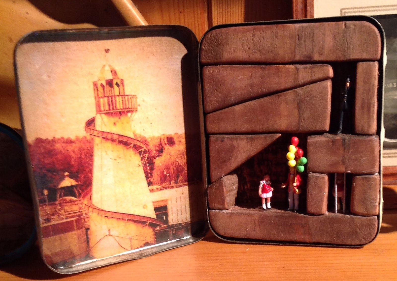
One of my next projects is to create a little diorama or collage using old puncture kit tins. I'm assembling some ideas but need to seek out a few lines from a poem about cycling. I can't remember the poem I originally found!
If it's possible, I'd like to make a collage using the contents of the tins in a little display alongside the tin diorama. I've already got some tiny cyclists to put inside the tins! One figure is mending a puncture so it's particularly fitting!
Not sure though if everything will stick on in such a way as to allow the hanging of the collage - and the opening of the tins!
After a long time away from the workroom I finally finished my 'Ashes to Ashes' David Bowie tin. Nicky helped me to finish it by customising the colours of the spaceman, Bowie figure and the mother figure (though we left her outfit red to co-ordinate with the artwork). I like the match between the spaceman image on the sweet tin and the space theme of the inside lid. I used quotations from the song on each side of the tin.
The beach image started out as a holiday pic from our sailing holiday in Greece (I was sitting on the beach but I cropped myself out). I played around with various filters to try to give an effect similar to the odd colouring on the Ashes to Ashes video.
I've been away from my blog for a while for family reasons.
With the Autumn upon us, Nicky and I decided to make use of the fruits of the garden (well not quite our garden). When I was a child I lived near rhubarb fields and we loved to eat the rhubarb - or 'tusky' as we called it then - raw, dipped into bags of sugar. More recently we've enjoyed a rhubarb gin cocktail at a wine bar in the Rhubarb Triangle town of Rothwell (where I lived from 11 to 18). We enjoyed it so much we decided to have a go at making some ourselves.
We used rhubarb kindly donated by our neighbours: the only other ingredients were a bottle of gin, some sugar and lots of patience.
We chopped and washed the rhubarb and put it in a couple of kilner jars with the sugar! Full recipe link here We shook the jars - lots of frosty looking rhubarb. After a night resting on the Raeburn the sugar had all dissolved into a gloopy syrup!
The next step was simply to add the gin. And wait!
And wait. And wait. About four weeks later the gin was ready to drink. It tastes absolutely delicious on its own - more like a liquor. Fever-Tree Aromatic Tonic also works well with it. We're saving the rest for Christmas!
I've had a long break from this blog - mainly because of another break - a broken hip! I had a fall in January and I ended up having to have a full hip replacement. The recovery process takes a while and it is only recently that I've felt confident enough to head back down the cellar stairs to our lovely below-ground workshop.
Just before my accident I made another Stourton tin. Once again I used a Pontefract Cakes tin and pasted a map of Stourton around the insert and on the back of the tin. This picture on the insert this time is a photograph of me and my sister Ann in our front street in Stourton. I'm the baby in the pram and Ann is in the toy car.
The railway figures in the tin were self-assembly and self-paint. I found the pram almost impossible to assemble - so fiddly! Nicky proved much better at this than me and assembled and painted everything. I gave the tin to Ann as a gift. I hope she liked it!
Still got a few tins halfway completed - next one to finish is my Bowie 'Ashes to Ashes' tin. Watch this space.
I made a tin as a special surprise present for my mum's 87th birthday. It includes a picture of the streets where we lived in the 50s and early 60s. The border inside is a map showing the town, Stourton (now completely demolished, church, schools and all). The inset picture is of mum and dad in their courting days, sitting on a bench in Stourton Park.
Mum was only about 15 or 16 at the time. The streets we lived in were called 'The Idas' after the wife of the man who built them. We lived on Ida Terrace. The houses were constructed from the bricks and rubble left from slum clearances. People used to say that the houses had the fleas built into them!
Here's a fuller map of the location on the back of the tin. I used a Pontefract Cakes tin because the road on the picture is Pontefract Road.
Mum was delighted with the tin and likes to tell the stories behind it to all the people who visit her. Here's mum on her birthday surrounded by children, grandchildren and great grandchildren!
My poem 'Google Earth' recently published by The Letterpress Project mentions Ida Terrace. You can read it on the site here.
Here's an image of the poem as it was originally published in the magazine Mslexia.
This arrived yesterday. I have four stories in here: 'Loft Conversion' (competition second prize); 'The Pond' (shortlisted entry); 'Bad Vibrations at Stratisfest' and "a Perfect Match' (both longlisted entries). I've had fun reading the other pieces of flash fiction in this Fantastic Books Publishing anthology. Love the cover!
Here's a taster - the opening paragraph from 'A Perfect Match'.
A Happy Anniversary - Roald Dahl
This year is the centenary anniversary of the year of Roald Dahl's birth. On November 3rd, the Letterpress Project launched a book of writings by adults and children celebrating Dahl's work.
The book Roald Dahl: The Man Who Believed in Magic is available from Letterpress in paperback form or in a free PDF. My poem 'The Whoopsy-whiffling World of Mr Dahl' is included.
A Sad Event
On November 7th, we heard of the sad death of the wonderful poet and singer-songwriter, Leonard Cohen. On an online blog, I shared my memories of a long-ago meeting with him. This was published by the BBC in an online article, listing experiences of everyday folk meeting him. You can read the article here.
The article includes a picture of me in the location where I met him. I and my friends used to sunbathe on rocks on the Greek island of Hydra close by to his favourite sunny spot! I'm the shy one in the frock!
Wow - this is almost 40 years ago! When did I get old? Here's another pic - converted by Prisma (more on Prisma later). This shows me sailing to Hydra.
Saturday, 1 October 2016
Creative Writing at Rose Cottage
Now that the weather is getting cloudier and the nights are drawing in, I'm looking forward to getting back to a few of my writing projects. Some new publications are in the pipeline.
Flash Fiction in 666
On Halloween, Fantastic Books Publishing will be launching a collection of horror-themed flash fiction in their anthology 666. Many of the authors included are winners, short-listers and long-listers from a recent Fantastic Books competition. The brief was to write a horror story in just 666 words. My story 'Loft Conversion' came second in the competition and my other entries were short-listed ('The Pond') and long-listed ('Bad Vibrations at Stratisfest' and 'A Perfect Match'). All four will be in the book.
Image copyright of FBP
Here as a taster / temptation are two images that inspired two of the tales.
This is a picture of one of my tins. An inspiration for 'A Perfect Match'.
And this is a spot near Rose Cottage. Look closely and you might see the inspiration for the spooky element in 'The Pond'.
This is the second time I've come runner-up in a FBP competition. My story 'Bar-code' came second in their science fiction short story competition and was published along with another of my stories. 'Human Fossil' in their winners' anthology Fusion.
I'm really proud to be included in the author team at Fantastic Books Publishing. It's a friendly publishing house which supports a range of charities. Here's a quotation from Dan Grubbs the CEO:
'We support over 20 charities, run an annual convention, sponsor a horse rider, a heritage railway and a small rally team, own a sound studio, have a fledgling film division and take care of the work of almost 100 authors while achieving our aim of giving our authors a fair share of the profits from their books.'
My interest in such forms developed a while ago when I created a Twitter Project based on the sayings or Gregueria of a Spanish writer, Ramon. Here are links to my Twitter page, Gregueria, and to James Lough's Twitter page.
Writer Interview in The Letterpress Project
I've just had an interview published by The Letterpress Project. This is a fabulous project that celebrates and promotes the love of reading real 'physical' books. Their website and Facebook Page form a wonderful repository of information about and musings on real books and the joy of reading.
The site also includes author interviews, new creative writing and a host of other resources. You can find my interview here.
Painfree Slimming
Well, kind of. Cutting down on drinks is quite a test of will-power.
We eat a lot of vegetarian meals. The one below is a favourite and fairly low in calories. A variation is to use paella for the stuffing with smoked mozzarella for Nicky and chorizo for me.
Roasted long sweet peppers stuffed with couscous and feta
Non-vegetarian meals usually include free-range chicken. The one below is really easy and not too calorific if you can possibly avoid the skin...
Thai roast chicken with red-curry coconut milk sauce
I love fish (Nicky doesn't) so my low calorie nights often include fish or shellfish. Sea-bass fillets are cheap and surprisingly low in calories.
Thai-spiced sea bass with asparagus and bok choi stir-fry
Here's a recipe with rainbow trout. A bit of naughty mayonnaise added.
Roast rainbow trout with lemon, garden herbs and sun-dried tomatoes
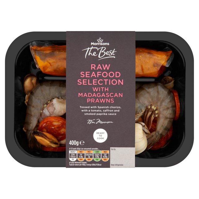
I once found the following ready-mix at Morrisons (never seen it since) and teamed it with 'zero' calorie noodles.
Seafood mix with Bare-Naked noodles
Here's my own variation using bargain scallops and chorizo mix (down to 99p from £5.50 at end-of-day Morrisons) and added touches.
Scallops and chorizo with red peppers and chilli sauce
Every now and then I treat myself to a juicy rib-eye steak. Quite high in calories but not too bad if you go easy on the extras.
Griddled steak and mushrooms with papaya and cucumber salad
Steak kebab with Indian spices
Black pepper steak kebab
And here's another recipe with Bare Naked noodles, using duck this time.
Chinese duck-breast stir-fry with Bare Naked noodles